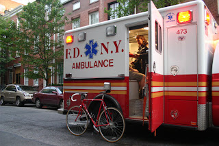
this is a ambulance in america with the recognised logo and the font that is recognised throughout.
again in america, there's the similar font and logo.
Ambulance in london with the simple font that is recognised and the logo.
a specific new york ambulance with the recognised font and the logo also
the logo that is on every ambulance's
My research has shown that all ambulance's have the same font in capitals, the one above shows a the front of the ambulance with the writing backwards which is common on some ambulances which I don't have a answer to why but i thought it would be a good idea to produce a piece of artwork with attempting to have the ambulance writing the wrong way round since it has a resemblance to them.
The three ambulances above are foreign and the top 2 have a different spelling of ambulance, but you can clearly see they all have the same logo and are near enough the same type of font.
after doing my research into the ambulances around the world i went on to illustrator and write down ambulance in the fonts that are used on the ambulances, i also made on of the word round the wrong way as if it would be put on a ambulance's bonnet, which ambulances in the uk are known for.


It is backwards so it can be read in a rear view mirror
ReplyDelete